Have you ever found yourself facing a massive amount of data and unsure of where to start with your analysis? Or perhaps you spend a significant amount of time organizing and sorting data into a structured format regularly.
These challenges are common when dealing with data.
However, there is a solution that can simplify your data analysis and streamline your workflow: a data visualization dashboard.
In this comprehensive guide, we will explore how leveraging data visualization dashboards can empower business leaders to achieve their goals.
The Importance of Data Visualization
You most likely have heard about data visualization and have used one before.
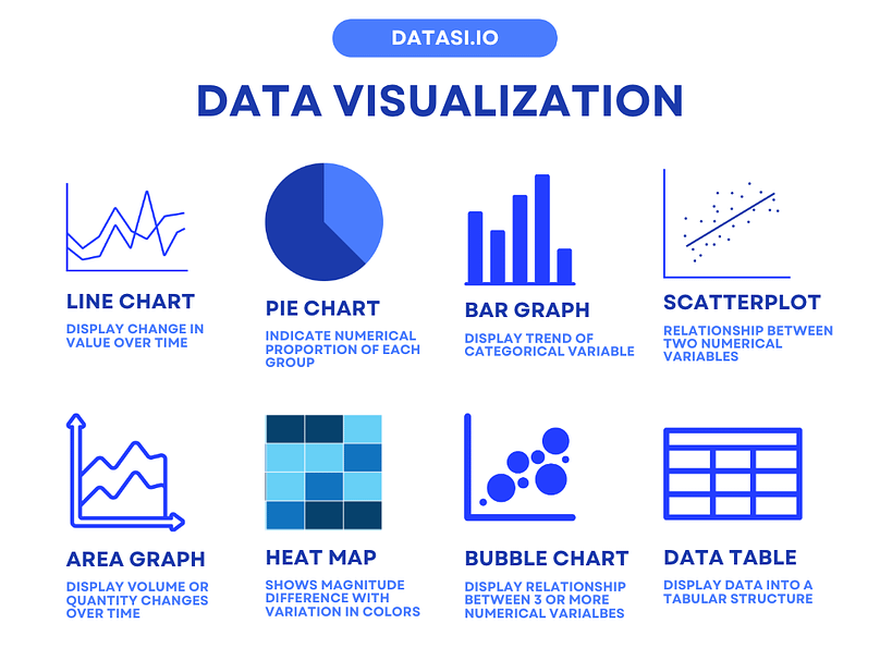
Data visualization is a technique that uses graphical representations such as charts and graphs to display information effectively. It is an effective way to organize and communicate data, particularly when dealing with large volumes of information.
Different graphs can be used to tell different stories about the data.
Visual representations have a profound impact on our brains, as the human brain is inherently wired to process visual information more efficiently than text or numbers.
In fact, 90% of the information transmitted to the brain is visual.
Data visualization leverages this innate ability to help us absorb and understand information rapidly. Here’s why visual representation is crucial:
- Pattern Recognition: Visualizations highlight patterns, outliers, and correlations in data that might go unnoticed in tabular form.
- Simplification: Visualizations simplify complex datasets, making them easier to grasp and interpret.
- Storytelling: Visuals tell a story, allowing data to communicate insights, trends, and actionable information effectively.
Modern businesses generate vast amounts of data daily. Managing and making sense of this data can be overwhelming. By leveraging visuals, you can process information more easily and quickly identify insights from complex data sets.
It has been proven that visuals can improve problem-solving efficiency by more than 19% and companies that adopt data visualization strategies experience a 24% reduction in meeting time, achieving both efficiency and effectiveness with just a simple change.
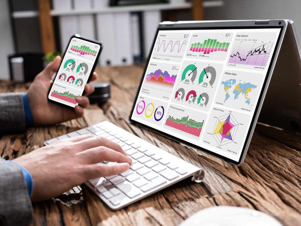
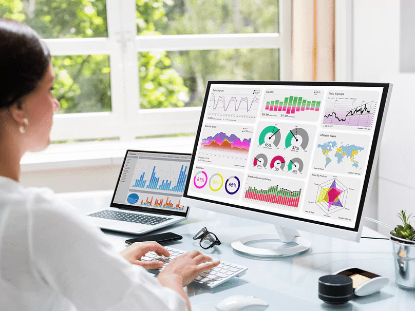
Understanding Data Visualization Dashboards
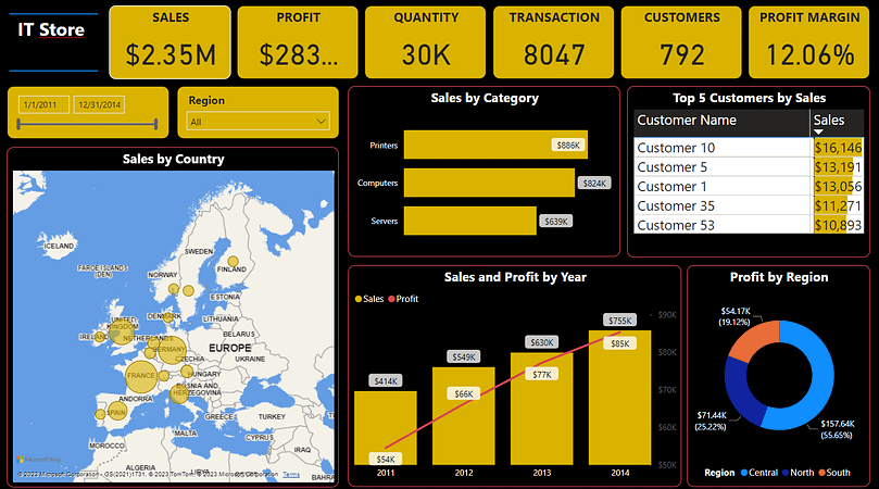
A data visualization dashboard takes data visualization a step further by integrating various visualizations into one interactive platform. It allows you to monitor all your Key Performance Indicators (KPIs) simultaneously and interpret your data from multiple angles.

Benefits of a Data Visualization Dashboard
1. Clarity and Simplification of Complex Data
As explained earlier, our brains have the tendency to possess visual information more easily.
With a data visualization dashboard, raw data can be transformed into visual representations, such as charts, graphs, and heatmaps, which are easier to understand at a glance.
This clarity is invaluable for decision-makers who need to quickly grasp key insights without diving into spreadsheets or databases.
2. Effective KPI Tracking
Tracking multiple KPIs across different platforms can be time-consuming and costly.
Most companies have at least 3 web analytic tools to collect data across their businesses. These data sit in different platforms such as Google Analytics, Facebook Analytics, or operation database.
It will be great if all of these data are integrated together on a single platform so we can analyze them easily. However, the reality is that most of us are monitoring and analyzing the data separately.

To prevent the problems with data silos, we can utilize a data visualization dashboard to solve the pains.
By integrating all your key data into a centralized platform, a dashboard can provide a single source of truth for your team.
3. Data-Backed Insights
Interactivity is a hallmark of data visualization dashboards. Users can interact with the data, drill down into specific details, and apply filters to focus on the information most relevant to their inquiries.
This empowers users to explore data dynamically and ask questions about the data as they arise, fostering a data-driven culture within the organization.
Visualization dashboards also enable users to identify correlations, patterns, and trends that might otherwise remain hidden.
Many Business Intelligence (BI) tools with advanced visualization capabilities also allow users to conduct advanced analysis with the data including comparative analysis, time-series analysis, predictive analytics, and so on.
These insights can help the decision-makers discover deeper insights and thus drive strategic planning, marketing campaigns, product development, and more.
4. Timely Problem Identification
A data visualization dashboard acts as a smart assistant, alerting you to anomalies or trends that require attention.
It also provides decision-makers with real-time access to relevant information. This timely access enables more informed and data-driven decisions.
Leaders can identify trends, outliers, and areas of concern, allowing them to respond proactively to changing circumstances and make strategic choices based on facts, not intuition alone.
In today’s competitive landscape, efficiency and responsiveness are crucial. An effective data visualization dashboard allows you to react with agility.
5. Real-time Updates and Reduced Repetitive Tasks
With a data visualization dashboard, you can access real-time data anytime and anywhere, whether on your phone, desktop, or through email notifications. You no longer need to produce fixed interval reports for insights.
Instead, with real-time data at the fingertips, decision-makers can be more efficient in their daily tasks, focusing on strategic activities rather than data collection and compilation.
6. Easy Collaboration Between Teams
Data visualization dashboards serve as a common language for teams and departments within an organization.
They facilitate alignment by presenting data in a format that is universally understandable. This alignment ensures that everyone is working from the same data, reducing misunderstandings and promoting collaboration.
7. Cost Efficiency
Compared to traditional reporting methods, data visualization dashboards can be a cost-effective solution. They reduce the need for manual data compilation and reporting, saving both time and resources.
8. Competitive Advantage
In a competitive market, having a data-driven edge is essential.
Businesses that embrace data visualization dashboards are better positioned to analyze market trends, customer behavior, and operational efficiency. This information gives them a competitive advantage, enabling them to adapt and thrive in changing environments.
[mailerlite_form form_id=2]

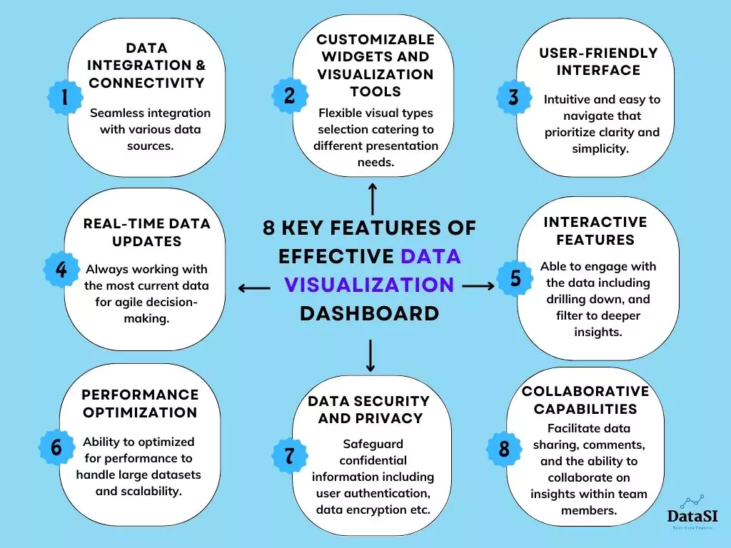
Key Features of Effective Data Visualization Dashboards
What are the key features that distinguish an effective data visualization dashboard from the rest?
Here are the 8 crucial features that can ensure your dashboard not only presents data but also facilitates meaningful insights and informed decision-making.
- Data Integration and Connectivity: An effective dashboard should seamlessly integrate with various data sources, whether they are internal databases, cloud services, or third-party applications.
- Customizable Widgets and Visualization Tools: Flexibility is essential. Dashboards should offer a wide range of widgets and visualization options to cater to different data types and user preferences.
- User-friendly Interface: A user-friendly dashboard is intuitive and easy to navigate. It should require minimal training for users to start extracting insights.
- Real-time Data Updates: Dashboards with real-time data updates ensure that users are working with the most current information available, which is crucial for agile decision-making.
- Interactive Features: Features like clickable charts, drill-down capabilities, and the ability to filter data based on specific criteria enable users to explore data on their own terms and uncover hidden insights.
- Performance Optimization: Dashboards must be optimized for performance to handle large datasets efficiently. Features like data caching and query optimization ensure that the dashboard responds swiftly, even with complex data queries.
- Data Security and Privacy: Protecting sensitive business data is a top priority. Dashboards should have robust security measures in place, including user authentication, data encryption, and role-based access controls to safeguard confidential information.
- Collaborative Capabilities: Encouraging collaboration among team members is essential. Dashboards should facilitate data sharing, comments, and the ability to collaborate on insights, fostering a data-driven culture within the organization.
Implementing Data Visualization Dashboards for Your Business
Now that you want to get your hands-on on building a data visualization dashboard, what are some of the key principles to bear in mind?
1. User-Centric Design
Always prioritize the end users when designing your dashboard.
Consider factors such as who will be using it, what devices they will use, the dashboard’s purpose, and the important metrics and dimensions to include.
Then, tailor the design to suit the specific needs, whether it’s a strategic, analytical, or operational dashboard.

2. Proper Chart Selection
Choosing the right chart types for each scenario is important to enhance understanding and interpretation of the data.
Selecting the appropriate visualization can significantly impact the effectiveness of your dashboard.
3. Reduce Redundancy
Besides using the right graph, also embrace the principle of “Less is More”.
Use only elements that are necessary to guide the audience’s attention to your message and the information they are looking for. Reduce overly ambitious and complicated graphs. Always put usefulness and clarity as a priority.
4. Avoid Overcrowding
Ensure that each page of your dashboard answers a specific question or caters to a particular user’s needs. Avoid overwhelming your audience with information overload.
The sales manager, HR, and marketing team might be looking for different numbers, so always think about users first, and design separate pages for different target users to provide a focused and tailored experience.
Conclusion
Implementing a data visualization dashboard can unlock the full potential of your business by simplifying data analysis, enhancing decision-making, and fostering collaboration.
By considering the key principles in data visualization design, you can create an effective data visualization dashboard tailored to your business needs
At DataSI, we have extensive experience in building effective data visualization dashboards that optimize team efficiency and drive business growth. Our expertise in user-centric design, chart selection, and dashboard optimization ensures that your dashboard delivers actionable insights and enhances decision-making processes.
Don’t miss out on the opportunity to unlock your business’s full potential. Book a consultation with us today to discuss how we can tailor a data visualization dashboard solution that meets your specific needs.

Talk to us today
Find out how we can help your business to build a successful data strategy.